Analytics and reports
Analytics is about understanding, not pretty charts. Svodly answers the usual questions: “where did my money go this month”, “which categories do I spend the most on”, “has my budget grown compared with last year”. This page is about how these reports work.
Summary
The app's main screen. It holds cards with the key figures for the current period (a month by default):
- Income / Expense / Net — the three top cards.
- Account balances — a compact list with balances.
- Top categories — by total expenses for the period.
- Budget progress — if there are active ones.
- Recent transactions — a feed of the 5–10 latest records.
The period switches with one click — week, month, quarter, year, a custom range.
Analytics — in detail
The Analytics section is built from a set of ready-made reports. They all work on the same model: you choose a period, a breakdown and filters — and the app draws a chart and gathers the figures.
Income and expenses by period
Two-colour bars of income and expense by month or week. You can see the dynamics — for example, that expenses are always higher in summer because of holidays.
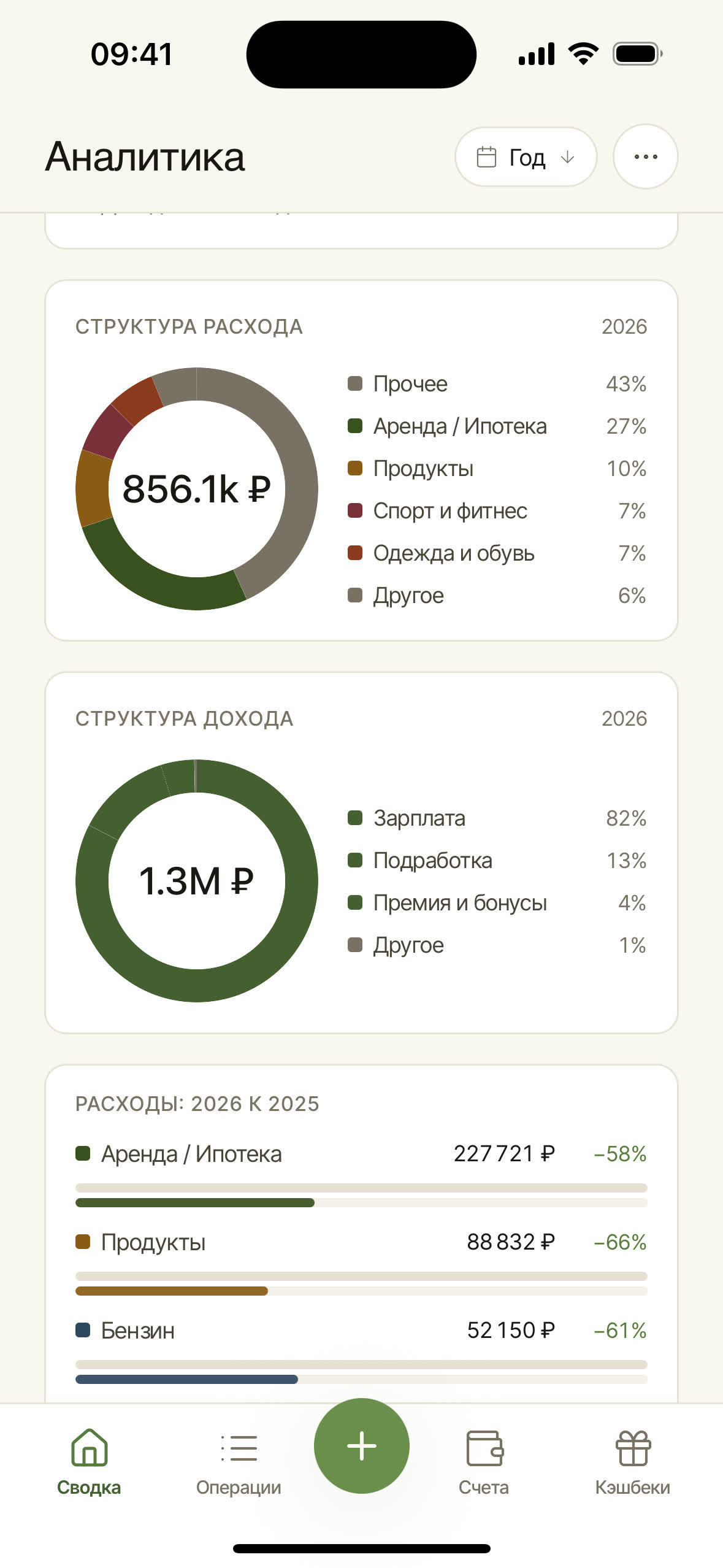
Structure by category and counterparty
A doughnut chart with the shares of top-level categories — a clear answer to the question “where does the money actually go”. Separate doughnuts are drawn for expense and for income.
Top-level categories are shown: if you have “Food → Groceries / Cafés / Delivery”, then “Food” appears as a single share, aggregating the nested subcategories. In the card header there's a breakdown switch “Categories ↔ Counterparties”: the same period can be broken down not by line items but by payees (on desktop and the web; on mobile — by category only).
Period comparison
Two bars side by side: “this month vs last”, “this year vs last”. You can see at once what grew and what dropped. You can compare arbitrary periods — for example, June–August 2025 against June– August 2026.
Top counterparties
The same “Counterparties” breakdown in the structure card answers the question of who received the most money in this period. Useful for business (top suppliers) and for personal finance (you'll see that 40% of “Food” is one delivery service).
What goes into analytics
By default — all transactions in the active book, except transfers (both within a book and cross-book). Transfers are excluded because they don't change the overall state of your finances — it's moving money from your left pocket to your right.
Transfers are always excluded — there's no separate “show transfers” toggle in analytics. To look at the transfers themselves, open the “Transactions” journal and set a filter for the type “Transfer”.
Several currencies in one set of analytics
If you have accounts in different currencies, analytics doesn't mix them automatically: amounts are counted within a single currency, and on a mixed selection the overall subtotal is hidden. There's no automatic loading of exchange rates — conversion is done only manually when transferring between accounts in different currencies.
Export
PDF and print forms are not supported yet. To export the figures to a spreadsheet, use the export on the Import & export page, and in a business book — the ready-made reports in XLSX and CSV.
Where to go next
- Budgets — how to turn observations from analytics into limits.
- Categories & counterparties — how the quality of your labelling affects how useful the reports are.
- Data export — if you need the figures in your own spreadsheet.